Learning how to build a landing page is essential for a highly successful website project.
Most websites contain the high-priority pages: Homepage, Product, Pricing, About Us, etc. These generic pages are designed to appeal to a wide audience. They’ll tell the story of your company: who you are, how your product works and why your customer should choose you as their provider.
Building a landing page allows you to be more targeted. Instead of painting the broad strokes, you’ll focus this page on a specific use case and persona — and do everything you can to convince them to take action.
Landing pages can be conversion engines. The average conversion rate for a website as a whole is 3.68%. Now compare that to 5.89%, the average conversion rate for a typical landing page.
It might not sound like much, but that’s a 60% increase in conversion rate! This data supports the idea that building highly targeted landing pages can give your website users the extra push they need.
My team at York IE helps growing tech and SaaS companies build effective websites on a reasonable budget. Naturally, we’ve spent a lot of time developing SaaS landing page best practices that drive meaningful results. In this post, we’ll dive in to those and share some exceptional SaaS landing page examples.
 What Is a Landing Page?
A landing page is a standalone web page created specifically for a marketing or advertising campaign. It’s designed to direct the visitor to take a singular action, such as making a purchase, downloading an ebook or filling out a form for a newsletter.
Whereas a website homepage is meant to broadly communicate your value props to a wide audience, a landing page is more specific. The homepage invites further exploration; a landing page is meant to remove potential distractions and help the user focus on the call to action (CTA).
Most users click on a landing page from a third-party channel, such as search engine results, social media or email. You could build a landing page for a variety of reasons: to rank highly in Google searches, support a paid LinkedIn campaign or serve as a CTA at the end of a marketing email.
How to Build a Landing Page
To build a landing page, follow these five steps:
- Identify your purpose and set goals.
- Decide the location of your landing pages within your website.
- Determine the layout of your landing page.
- Set up tracking and KPIs.
- Solidify your promotion plan.
1. Identify your purpose and set goals.
To convince the visitor to take your desired action, you’ll have to present a clear and compelling case for doing so.
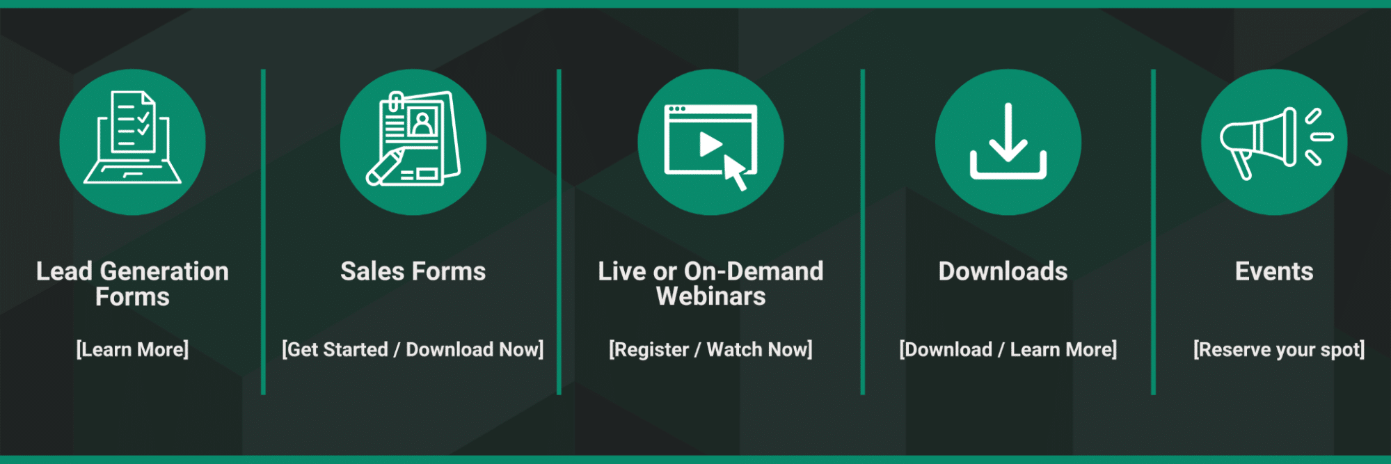
Start by outlining your goals and objectives. This will help you determine the type of landing page campaign you’re running. A few examples:
- Lead generation form
- Sales form
- Webinars
- Downloads
- Events
Before building the landing page, it is important to identify the target audience for the campaign. This will help you tailor the content and design of the page to appeal to the specific needs and interests of the audience.
Your landing page goals should be aligned with the overall customer journey, from initial awareness to consideration and eventually, conversion. Clearly define what you want the visitor to do on your landing page, such as filling out a form or making a purchase.
Don’t forget about measurement. Set goals that are achievable based on the traffic to your landing page and the conversion rate of similar pages. Use metrics such as conversion rate, cost per conversion and return on investment to track the success of your landing page. More on that in a second!
2. Decide the location of your landing pages within your website.
Make it easy for visitors to find and access the page. Here are a few options for where to locate your landing page:
Homepage: Create a landing page as a standalone page within your website and link to it from the homepage.
Subpage: Build your landing page as a subpage within your website, under an existing top-level page.
Standalone domain: Develop a landing page on a standalone domain, separate from your main website. This can be useful for running specific campaigns or for testing purposes.
Overall, the most important thing is to ensure that the landing page is easy to access from your intended source(s), such as your website, social media or paid advertising campaigns.
3. Determine the layout of your landing page.
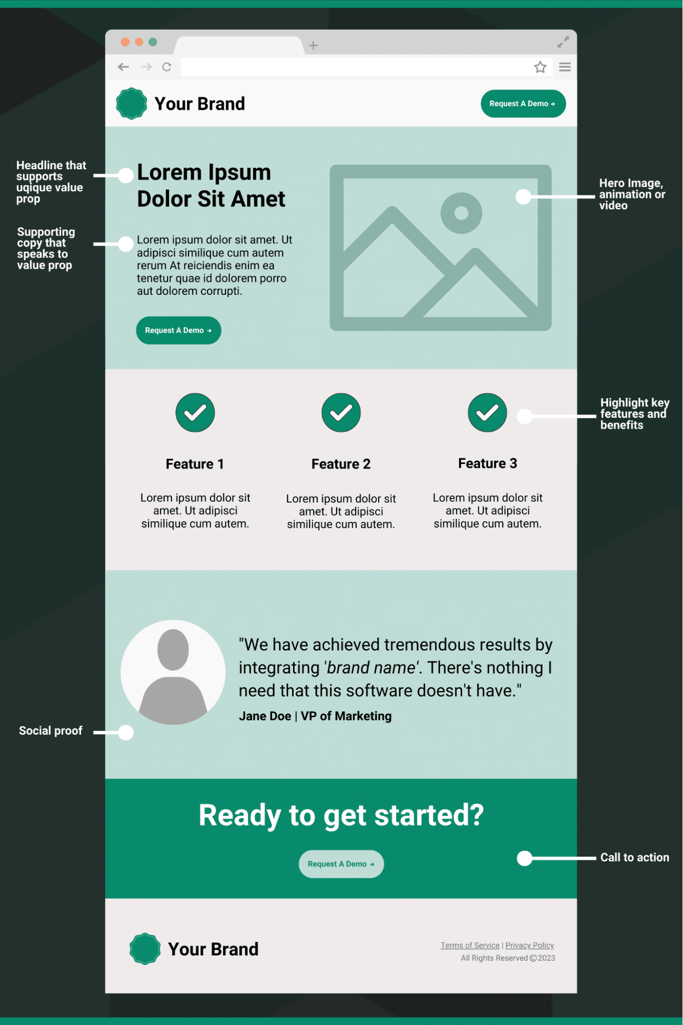
Every landing page is unique. However, the anatomy of a successful landing page is well formulated. Use the following landing page elements checklist to ensure your new landing page has all the important pieces for a successful campaign:
Headline: The headline should grab the reader’s attention and communicate the main benefit of your product or service.
Value proposition: Clearly explain what makes your product or service unique and how it will solve the reader’s problem or meet their needs.
Images and video: Visual elements can engage the reader and illustrate the benefits of your product or service.
Social proof: Testimonials, ratings and other forms of social proof can help to build credibility and trust with the reader.
CTA: The CTA should be the page’s main focus, and it should be easy for the reader to understand what they need to do next.
User-friendly experience: Use white space and clear headings to guide the reader’s eye and make the page easy to scan. Make sure your landing page is mobile-friendly.
It’s important to regularly review your landing pages to ensure an optimal layout. Use A/B testing to determine which elements of your landing page are most effective, and make changes based on the results.
4. Set up tracking and KPIs.
There are several tools that you can use to track the performance of your landing page and measure progress toward your business growth goals. Google Analytics continues to be the industry standard. It allows you to track a wide range of metrics, including page insights, conversion rates and cost per conversion.
UTM (Urchin Tracking Module) parameters are used to attribute and track the performance of online marketing campaigns and your marketing channels. By adding UTM parameters to the end of your landing page URLs on a channel-by-channel basis, you can track metrics such as the number of clicks, the source of the traffic and the specific campaign that the traffic is attributed to in Google Analytics.
Regularly review your key metrics to see how your landing page is performing and make adjustments as needed.
For instance, if your pageviews and time on page are optimal, but the conversion rate isn’t hitting your target, consider testing variations of the CTA or form copy to be more compelling or format variations for a better user experience.
5. Solidify your promotion plan.
A landing page won’t drive much traffic unless you have a plan to promote it.
Allocate a budget for the campaign promotion, considering factors such as the target audience, promotion channels and desired reach. Choose the promotion channels that are most appropriate for the target audience and goals of the campaign. This might include social media, email marketing, paid advertising, content marketing or public relations.
You’ll need to write copy for the ads, emails, or blog posts that the landing page will link to. Be sure to include consistent messaging that matches the landing page and a clear CTA that encourages the audience to click.
Why Do You Need Landing Pages for a SaaS Website?
Landing pages are an effective way to increase website conversions because they allow you to create a targeted and personalized experience for the user. Building a landing page might come in handy when you’re hoping to achieve a specific goal: acquiring new demo leads, capturing newsletter subscribers or racking up downloads on a gated asset.
A well-designed landing page will simplify the website experience for the user. Instead of hovering over dropdown menus to find what they need, the user is taken directly to the information they’re seeking.
Let’s consider an example. Many SaaS websites appeal to different audiences. Maybe your product works for companies in multiple industries: automotive, manufacturing, surveillance, etc. You could build a landing page for each specific audience segment, helping showcase your platform’s unique value props for each user persona.
That way, if an executive in the automotive industry clicks on a LinkedIn ad, they’re taken directly to the information that’s most relevant to them. They’re not left to wade through the website on their own; their journey is simplified and optimized for conversion.
SaaS Landing Page Examples
Here are four examples that effectively follow SaaS landing page best practices:
No-IP: IPVanish partnership landing page
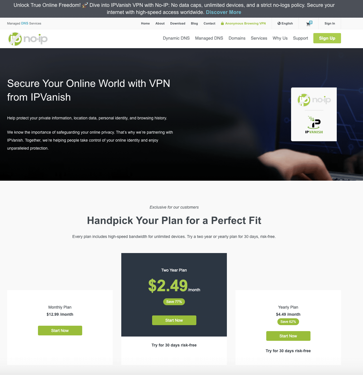
Here’s a SaaS landing page example we helped produce for one of our clients, No-IP, a provider of dynamic DNS services. Our team built a landing page for NO-IP’s partnership with IPVanish. The page clearly demonstrates the value of the partnership from the start. Its content is action-focused, giving the visitor the information they need to make a confident decision and easily convert.
York IE: Newsletter landing page
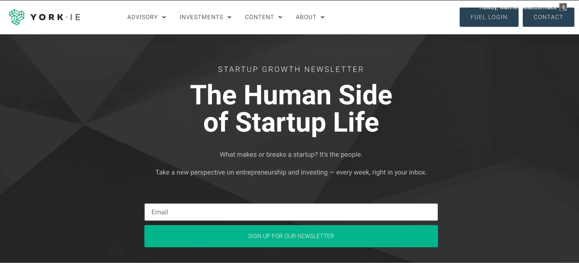
A quick in-house example! We created this page to drive folks to sign up for our Startup Growth Newsletter. It’s straightforward and includes a single, clear CTA.
HubSpot: Sales Hub landing page
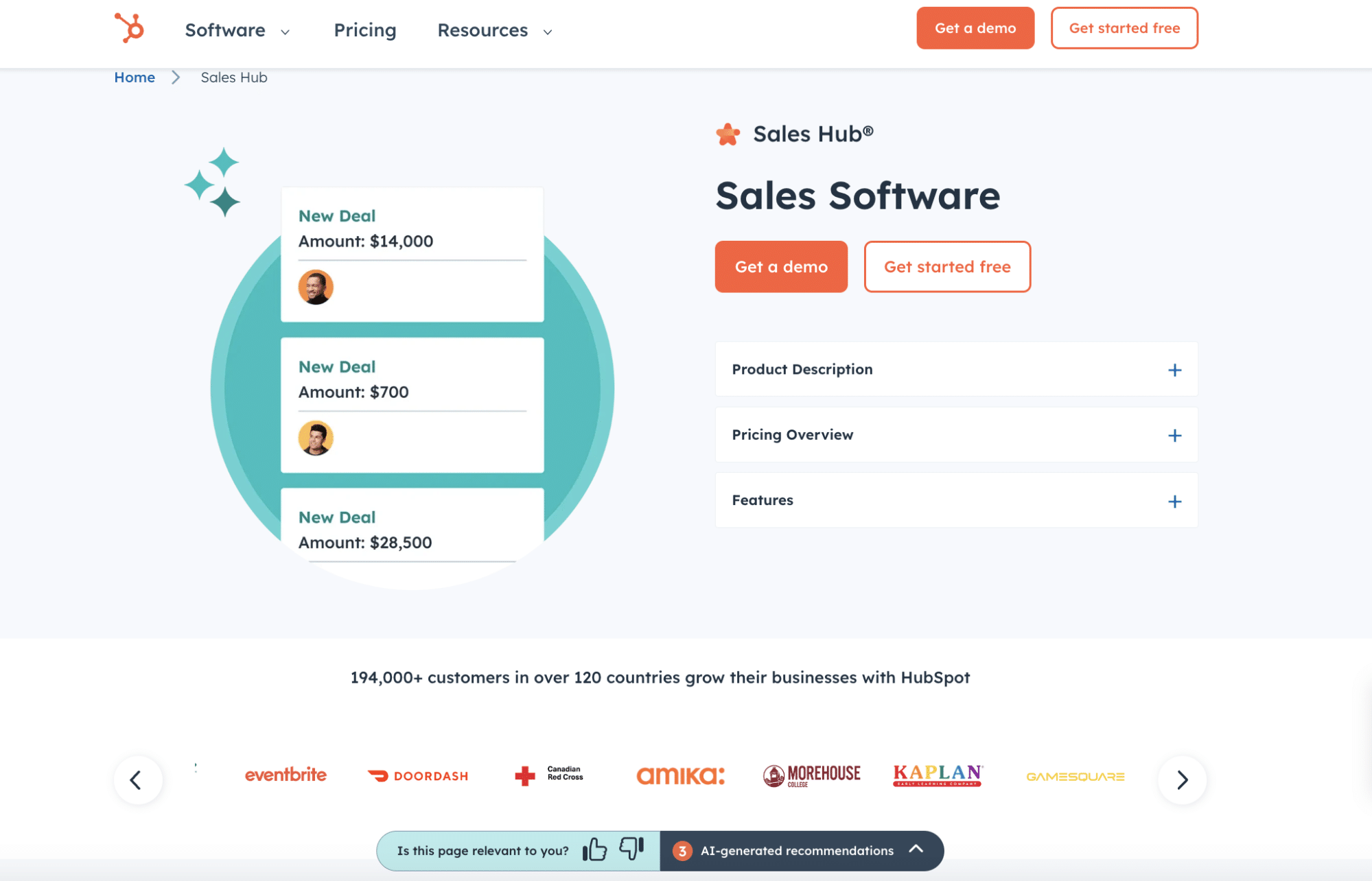
As you might know, HubSpot offers customer relationship management (CRM) software. This software can be used by a variety of personas: marketers, customer success managers, business development reps, etc. HubSpot’s Sales Hub landing page caters specifically to those looking to leverage HubSpot for sales.
The page offers high-level info (product description, pricing, features) that sales professionals would care about.
ClickUp: Slack partnership landing page
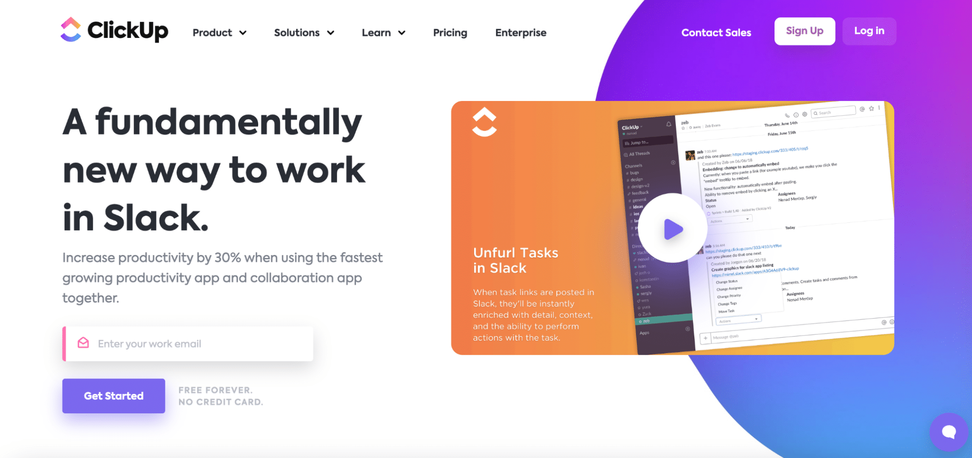
ClickUp is a product management tool that helps companies organize, track and collaborate on tasks. Naturally, ClickUp has integrations with a variety of workplace productivity tools, including Slack.
Their Slack landing page provides a deep dive into the specific value props of using ClickUp and Slack together.
Need Help Building a Landing Page?
There are a lot of moving parts that go into building a successful landing page. Sometimes, busy operators could use a little help with strategy and execution.
The team at York IE is highly experienced in developing websites for high-growth companies. We’ll assist with everything from crafting website copy to the back-end development of your site.
Chat with our team to learn how we can help you build a landing page and more. Increased conversions and a highly personalized user experience aren’t far away!


